3 questions to Soo Heyvaert
Soo Heyvaert, Head of interior Design at Belgian Studio King George
I – King George has a unique and singular identity, what would be the three words to describe the agency?
Full service, rebellious and on-trend.
At King George we always tackle projects with the whole team. Interior designers, graphic designers and marketeers join forces, each with their own unique vision and expertise. The common goal is to always thrive towards innovation and surprise. We don’t follow trends but prefer to complement them with our own intuition. For example, we could be selecting 4 completely on-trend materials, but we will always add 2 extra ones that we feel strongly about. Those options won’t be the safest bet and might divide the audience, but they’re what we believe in. That’s our little act of rebellion. I believe King George’s DNA is rooted on the crossroad where the easy going meets the uncomfortable.


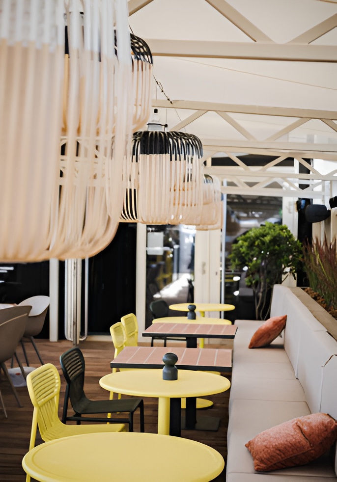

II – King George devises its projects from A to Z. Can you tell us more about the strategy and concept behind the Yalo hotel in Gent?
Our client, a project developer from Ghent (Belgium), bought this abandoned and dilapidated mall in the centre of the city. It looked absolutely grotesque at that time and was as far from functional as you can get. Very 80’s let’s say. The complex has a 6-storey building at the front and a large atrium with glass dome at the rear.
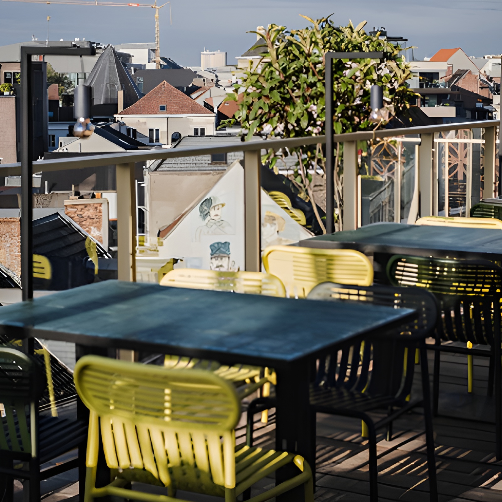
They put the whole development on our plate. Questions such as ‘which direction are we taking this’ and most importantly, ‘how are we going to do that’? The only thing they gave us in the briefing, is that they were kind of digging the idea of a hotel. So, the King George machine was put in motion, and we started working with all the factors of the task, putting the location of the complex up front as the major profit. We wanted to create a place both for the Ghentian locals as the (international) visitors of the city. So, we decided on a bar/restaurant with a hotel to it. Not the other way around. With this vision as a focal point, we created an attractive place with a big nod to the golden age of the 50’s cocktail bar, without falling into clichés. We complemented original vintage design with modern materials and shapes. Two examples of that are the use of the Petite Friture wallpaper and iconic Weekend collection. The unique take on the widespread bohemian jungle vibe of the Jungle décor makes it fresh and graphic. Weekend is the perfectly accessible connection between the past and the present.
The biggest hurdle to take was the airy atrium at the rear. The 80’s vibe was still very much present in the concrete structure. The space was flooding in light, had an enormous height and was stained by clumsy structural elements. So, during summer it was too hot, during winter it was too cold. It was a challenge! But we managed to shift it into the beating heart of Yalo. We approached the open plan idea very cautiously and installed a central bar as some sort of compass around which dining, having breakfast or lunch, working, waiting, … is now orbiting. Thanks to the flexible customization on the floor, the dark wood that completements the 80’s concrete and a well-thought-out lighting plan, the atrium now is a year-round show stopper, and forms the true identity of Yalo.
III – And finally your favourite piece among the Petite Friture collections?
Without any doubt, the dining chair from the Fromme collection! Fromme is such a wonderful example of good design. A simple piece of seating furniture in aluminium, brought to life with a gentle powder coating in interesting colours. It detaches itself from current trends and yet it’s totally in line with the rebellious nature of Petite Friture. Just the way I like it! The finesse of the Fromme chair is reflected in the slender seating shell and backrest. It is super thin metal of just a few millimetres thick, elegantly flowing on rubber cushions for comfort. The chosen material and proportions of the chair make it visually very light and compact. A perfect combination of discretion and technique. And a way of Petite Friture to show that it’s more than just a good-looking rock n’ roll brand. The Fromme design is strong enough to be used in a kitchen in a classic cottage, but also looks good on a sleek poly concrete terrace in the city. I am such a fan of the considerate work that designer Tom Chung created.

-
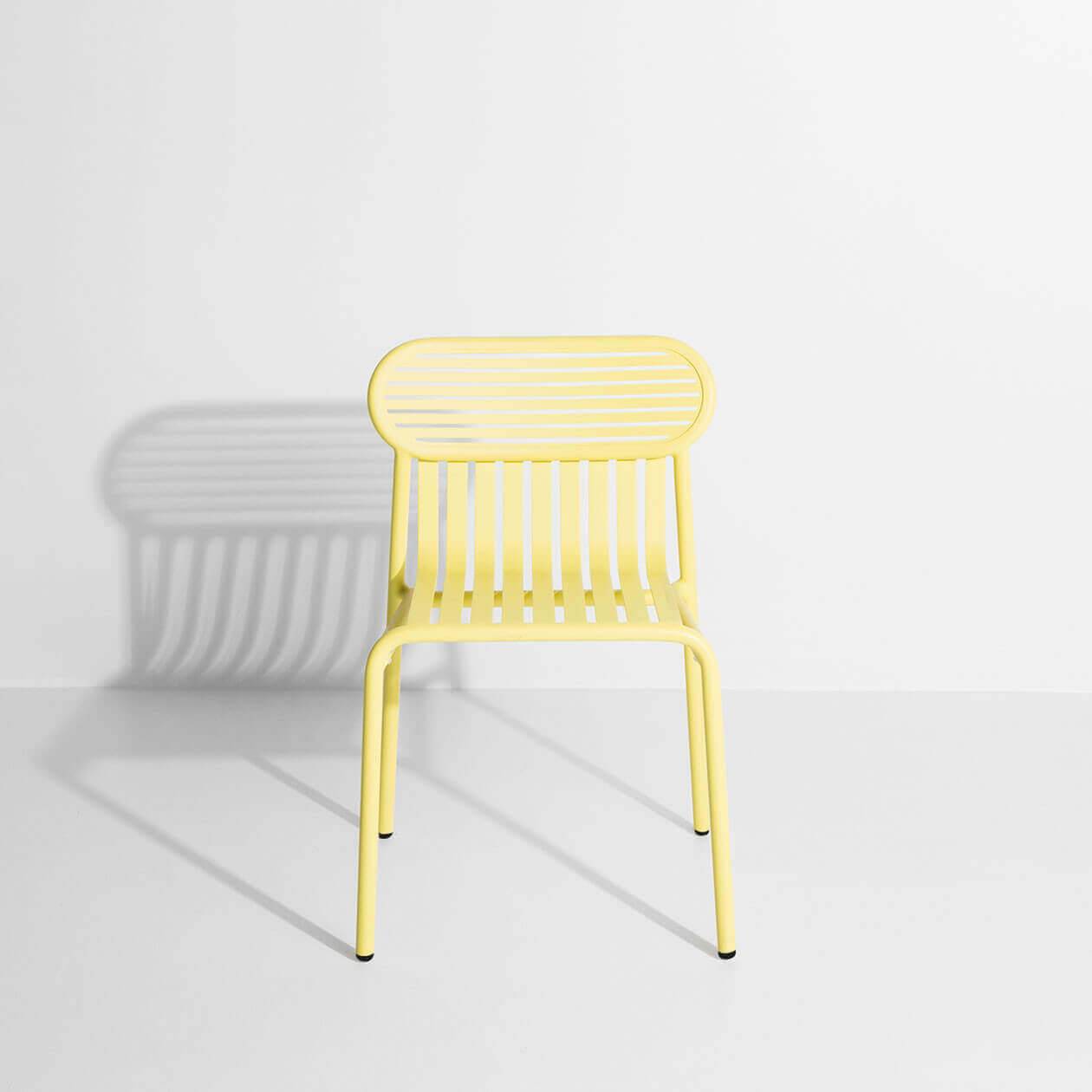
Week-end Garden chair - Yellow
-
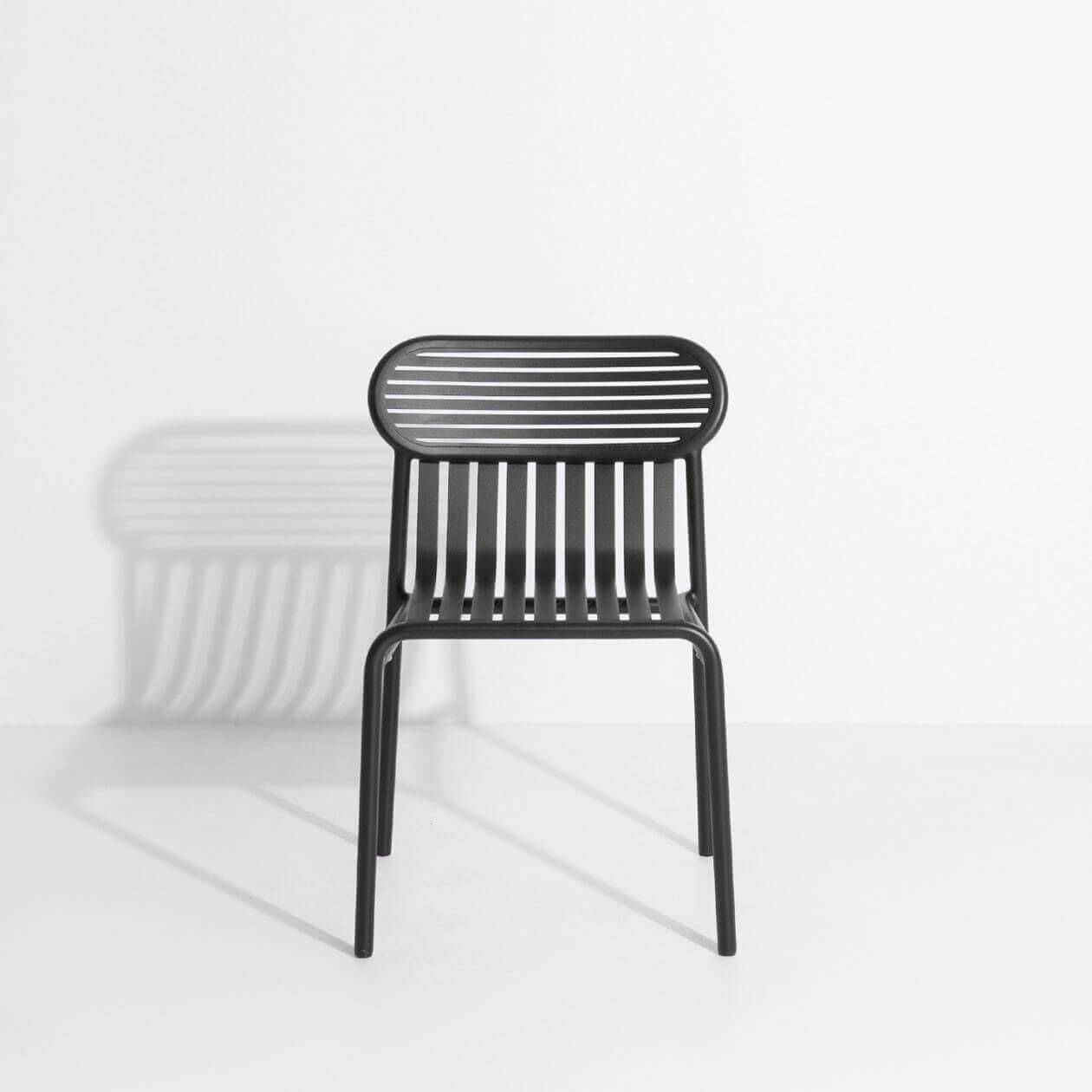
Week-end Garden chair - Black
-
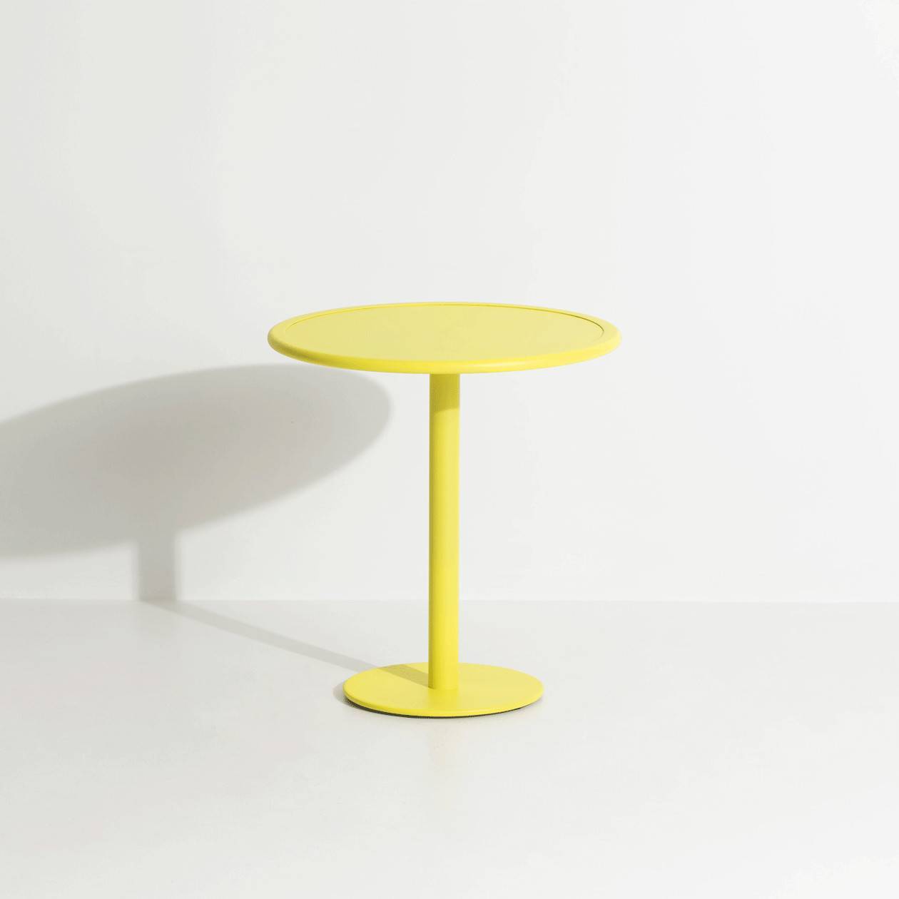
Week-end Round dining table - Yellow
-
3 QUESTIONS TO DAPHNE DESJEUX
The decor for Mondaine was born of a fantasy… The pinnacle of chic, weapon of mass seduction.Discover
One dreamt up by a beautiful bourgeois woman, a socialite wanting to organise a night to remember for a select handful of close friends. -
Week-End settles in to a refined french guesthouse
Beautifully restored, the longère-style farmhouse now features unique design pieces, including Week-end outdoor furniture, in a black finish to blend in discretely with the grounds’ 2 hectares of wooded park.Discover